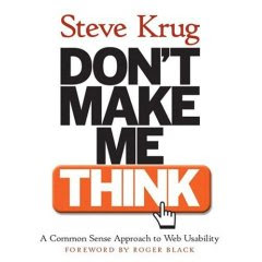
The book discusses how to optimize website design to enable users to breeze through the navigation, without having to think. Here are some of the good lessons/take-aways from the book:
1. When you're creating a website, your job is to get rid of the questions that users face when they look at a page. ("Where should I start? Why did they call it that? Can I click on that? Why did they put there there? What is this?") Everything should be obvious to the user--what the site's purpose is, what they should do, etc.
2. People don't usually read web pages--they scan them. They tend to focus on words and phrases that seem to match the task at hand, or their current/ongoing personal interests. There are some trigger words that are hardwired, such as "sex," "sale," "free," and our own name.
3. Design pages for scanning by following 4 simple rules:
- Create a clear visual hierarchy on each page: the more important something is, the more prominent it is; things that are related logically are related visually; things are "nested" visually to show what's part of what
- Break up pages into clearly defined areas: glancing around, users should be able to tell, "Things I can do on this site! Links to today's top stories! Products this company sells! Navigation to the rest of the site!"
- Make it obvious what's clickable
- Keep the noise down to a dull roar: eschew business and background noise; simplicity is good
4. Get rid of half of the words on each page, then get rid of half of what's left.
No comments:
Post a Comment